

Wednesday, 22 November 2017
Forest of Equilibrium
I’m listening to Cathedral’s brilliant album Forest of Equilibrium this morning, and the record collector-completist in me is always frustrated by bands that turn in one great record and fill the rest of their discography with duck eggs and while Cathedral disciples will balk at that comment (nine more albums followed), the band never did make anything near essential as their 1991 debut. I’ve raided songs from their later albums on youtube before posting this and it’s surprising how uncompromising this early Forest of Equilibrium incarnation of the band was, with those sluggish monolithic, low-end riffs suggestive of a lumbering piece of heavy machinery running out of gas. Apart from the NWOBHM-boogie of the track Soul Sacrifice, one might imagine the band recording the album in a vat of molasses. I was just looking thru the CD booklet and on the Thanks & Acknowledgements page there are mentions for Black Sabbath and Pentagram (naturally), but also for Comus, Diamanda Galas, Goblin and Dead Can Dance, which may account for the album’s disorientating beauty – the pastoral flute refrain that ushers in the huge opening riff of Commiserating the Celebration, the eerie synthesizer textures of the album closer, Reaching Happiness, Touching Pain; and perhaps the highlight of the record, the long coda of the title track in which the roar of distorted guitars fades out to be replaced by the chimes of a music box which might have strayed from one of Hellraiser’s Lemarchand's boxes. Lee Dorrian retains the hoarse voice of his Napalm Death days but the indecipherable growl heard on From Enslavement to Obliteration has retreated into a sorrowful, pleading lamination, And worth mentioning too, Dave Patchett’s stunning Bosch-inspired artwork (which looked especially spectacular on the gatefold LP) which seems to have taken its cue from the strange, unsettling tangle of inhuman voices that closes The Serpent Eve…


Wednesday, 8 November 2017
Laserdisc Collecting: Blade Runner (Japan, 1987, Warner Home Video)
There's been much talk of Blade Runner these past few weeks with the arrival of the sequel, some 35 years after Ridley Scott's signature film was first released, and it seems as good a time as any to present my Japanese laserdisc copy, originally released in 1987. The Japanese were treated to at least 5 distinct laserdisc editions of the film - three of which came with unique photo montage artwork, while the other two editions, the very first laserdisc release from 1985, and fifth edition, the 1992 Director's Cut, simply featured John Alvin's iconic artwork. Of the 3 editions that sport alternative artwork, the 1987 issue is the most lavish, borrowing the Criterion laserdisc's European Theatrical Cut and issued as a heavy two disc-set and housed in a beautiful gatefold sleeve brimming over with Japanese text (which lends a nice Asian connection to a film which takes place in a very Sino-flavored Los Angeles). I particularly like the photo montage on the front, it's stylish and refreshingly uncluttered and coherent, and making fine use of Syd Mead's futurist designs - the Tyrell building rubbing shoulders against LA's toxic skies, and I like the solar flare effects of the spinners.


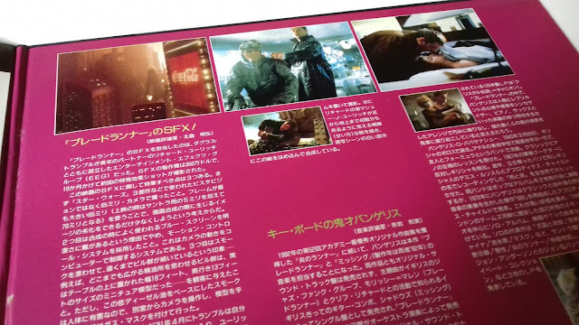

Of the supplemental material which has been ported over from the Criterion laser, I'm most intrigued by the Blade Runner Trivia Test which I'd like to take, but haven't been able to find it online !


Inside gatefold - left side

Inside gatefold - right side
Inside gatefold - bottom right side - list of supplements
Of the supplemental material which has been ported over from the Criterion laser, I'm most intrigued by the Blade Runner Trivia Test which I'd like to take, but haven't been able to find it online !

One-sided insert
Monday, 6 November 2017
Covering King
For the past few days I've been re-reading the excellent 1988 book Bare Bones: Conversations on Terror with Stephen King, which gathers 30-odd interviews with the Elvis Presley of Horror fiction (as editor David G. Hartwell calls him in his introduction to the short-story anthology The Dark Descent). In one of the more interesting chapters in the book, the conversation turns to King's book covers - a subject little explored in most interviews. Not surprisingly, this interview first appeared in Heavy Metal magazine, and while it makes for fascinating reading, I was frustrated that there were no illustrations to accompany the text. Digging out my scanned copy of the February 1980 issue of Heavy Metal, the original interview is also bereft of graphics, so with that in mind, I thought it might be worthwhile to present the entire section of the Heavy Metal piece with the appropriate illustrations.
Bhob Stewart: We broke off last issue with a mention of New American Library designer Jim Plumeri's visual concept for King's Night Shift collection: a clever double cover with six eyes peering through die-cut eye slits in the dark blue background. Opening this front cover to page one you discover that the eyes are actually socketed into the palm, thumb and fingers of a half-bandaged hand, a Don Brautigam illustration of King's story I Am the Doorway about an astronaut back from Venus who finds that aliens inside him are metamorphosing his body. Brautigam's skilled use of surrealism techniques earned him a Society of Illustrators award for this airbrush/acrylic painting. Equally effective are Plumeri's other award-winning covers for King titles. "I call them occult solutions" says Plumeri. "When I did Stephen King I was looking for the most unusual solutions I could possibly find. My job is to make people stop and pick the book up. I can't drag them to the cash register. but I can sure as hell make them pick it up."


For the first million copies of the paperback edition of The Shining, Plumeri devised a small, faceless head and had it printed in black on a glistening silver mylar. "I don't have to have that kind of visual now. I can just put "Stephen King". By the time The Shining comes out by Kubrick, with Jack Nicholson in it, I think all I have to do is put a big STEPHEN KING on the cover. The Shining is Kubrick's baby; whatever he has for his advertising visual I will do. In all movie tie-ins the movie usually supplies us with their advertising art and typography. It's a chance where they get extra exposure and we get exposure. One hand washes the other."
Plumeri's occult solution for the initial paperback printing of Salem's Lot won an award from the American Institute of Graphic Arts. This was a cover of lustrous solid black - no title, no blurbs, no byline - with a single, tiny drop of red blood at the mouth of an embossed head hardly visible unless held and angled so that the embossing can catch the light. Plumeri chose type designer Pete Gute to handle the illustration because Gute had previously worked with embossed type. A follow up version of this cover added a silver embossed title above the embossed head. In its final form (the one currently in bookstores), the embossed cover was replaced by a photograph of the same head with regular flat printing. "That happened because we ran out of the special black stock." Plumeri explained. "I had photographed the original head see how it would work with dramatic lighting on the raised surface. When we ran into this emergency. I pulled this photograph out and decided that it could be used for art."

The paperback jacket for The Stand has a frightening beauty that goes beyond the merely hypnotic to become a trance-inducing glissade into ethereal evil. It combines a Richard Rossiter type design with a Brautigam airbrush painting based on a Plumeri concept sketch. "I use paint or pastel - whatever is available to give me the effect that I'm trying to portray to the artist" said Plumeri. "The sketches are rough. but they can see the concept without any problem. Don and I work well together. Throughout The Stand the evil character is described with these burning eyes, almost red, and the there is a symbolism of a crow that pops into the book at different parts. Someone sees the red, glaring eyes. and for a second thinks he sees this evil character. At that point I thought of this double image using the black crow and the evil and letting one eye work for both to give it this supernatural quality. "

Where Jim Plumeri's conceptual transpositions of King's writing into innovative paperback covers have been appropriate, relevant and ambiguously intriguing, the Doubleday hardbacks with a yawning indifference to King's fresh slant on contemporary horror fiction, have featured only mundane designs and illustrations so trapped in tradition that they lack any genuine imaginative thrust. Stephen King's own reactions to the art that wraps his words kicks off Part 2 of this serialized interview:
Bhob: The jacket on the hardback Carrie has nothing to do with the book.
Stephen King: Yes, well. it doesn't. My editor and I had a concept on that, but of course, one of the things about Bill Thompson, my editor, was that he was a man with relatively little power at Doubleday and it kept showing up in funny little ways. When I left Doubleday, they canned him. It was kind of like a tantrum: "We'll kill the messenger that brought the bad news." Our concept of the jacket would have been a Grandma Moses-type primitive painting of a New England village that would have gone around in a wrap to the back. But the jacket was done by Alex Gotfryd, who does have a lot of power at Doubleday. What he gave us was a photograph of a New York model who looks like a New York model. She doesn't even look like a teenager.

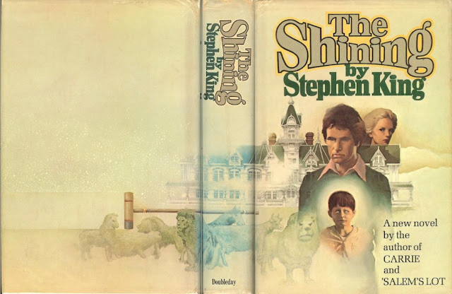
Bhob: How do you feel about the montage on The Shining hardback?
King: Don't care for that either. It makes the people look too specific. It's almost a Gothic romance jacket. There are some nice things about that jacket - I object to the faces of Jack, Wendy, and the little boy, but I like the concept of having the hedge animals. The hardback Night Shift has a classy jacket of just words, but it looks like a Doubleday-type jacket for a book they didn't expect to sell. There's nothing really exciting about that graphic.

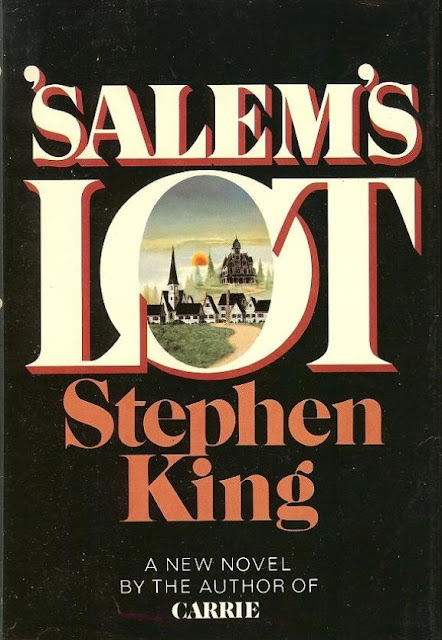
Bhob: The long-distance view of the town on the Salem's Lot hardback doesn't indicate the book's true nature.
King: I think that was intentional. The flap copy on Salem's Lot is a real collaboration: my editor wrote part of it, his secretary wrote part of it, I wrote part of it, and my wife wrote part of it. It was just an effort to say something without saying anything. Of all the Doubleday jackets, I think that I like The Stand the best, but Salem's Lot runs that a close second. I like the idea of the black background with the town inset in the "O" of Lot. You can look into the town, and you see the Marsten house. That's a pretty decent jacket. That was the best produced book by Doubleday: all the way around, that was a good piece of work.
The illustration for the hardback of The Stand was taken from a Goya painting, The Battle Of Good and Evil - it was repainted. I was mad that they didn't give poor old Goya a credit.1 There are a lot of people who are rather literal-minded, kind of nerdy about book jackets, who don't like it because they say that it doesn't look like what the book is about. But it looks like what the spirit of the book is about. New American Library's The Stand cover is super. I think that it's a good one: I like the dark blues and turquoises in it. The paperback covers have always been better because paperback people seem to understand how to market books, how to go about that. Illustrators and designers don't get credit on paperback jackets the way they do on hardcovers.

Bhob: Then there's The Shining in mylar...
King: Except that it was discontinued, as was the dead black cover on Salem's Lot. Both of those were expensive covers. The Salem's Lot cover cost seven cents right off the top of a book that originally sold for $1.95. The mylar was nine cents, and in addition, the mylar cover buffs. It doesn't peel, but the lettering and picture gradually buff off the book. Now they just have a plain paper cover with the same picture: it's not as eye-catching, but it lasts longer.

Bhob: Did it occur to you that the wearing away of fragments of The Shining's cover produces a strange, corrosive effect that some readers might consider an additional horrific bonus?
King: I hadn't thought of it that way - maybe it is. There are people who treasure those copies: some
day maybe those will be worth some money, especially the ones that are in good condition, because on the ones that have been read. the cover wears off very quickly. The mylar was really discontinued not just because it buffed in people's hands, but because it buffed in the boxes when they were shipped. I also like the paperback Night Shift cover: it's a deep. dark. rich blue. Some of the editions are perfect, and on some, the holes are not over the eyes. Again, that was a difficult one to do: there is such a thing as being too clever by half.
Bhob: What was on the Carrie paperback before the movie tie in?
King: That cover has gone totally out of print. The original paperback had no title, no author, no printed material of any kind on the front cover. It simply showed a girl's head floating against this blue backdrop — a pretty girl with very dark hair swept back. It was a painting. a rather nice one(by James Barkley). Inside, there was a second jacket. Originally. it was to have been die-cut down the side in a two-step effect: the title, Carrie, reading vertically down the right-hand margin, was supposed to show and, at the last minute their printer told them that he couldn't do it. Inside there's this town going up in flames, and that is an interesting effect. You reach the end of the book, and there's a photograph on what they call the third cover of the same town crumpled up into nothing but ash. I don't know if that's ever been done before: having another picture inside the back jacket. These were photographs (by Allen Vogel) of flames and a model town that looks as though it was one of these origami things created out of cardboard.


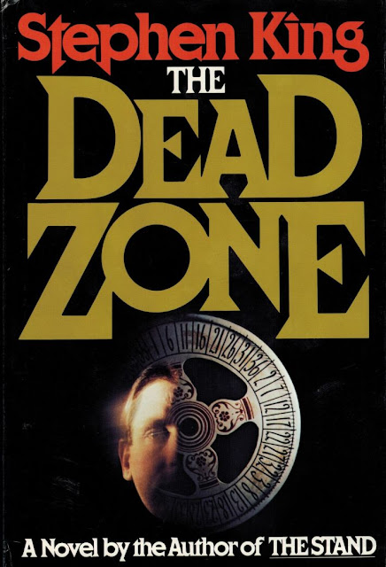
Bhob: The One + One Studio's design for The Dead Zone (Viking) illustrates the repetitive wheel-of-fortune device used throughout the novel.
King: I like that jacket pretty well. I think that, in a large measure, it's been responsible for some of the book's success because it's a very high contrast type, something I think Viking might have lifted from the paperback houses. It comes out at the reader there's so much black. The thing I don't like is the photographic effect: I've never cared for photographed jackets. I can't really even say why, but they seem too realistic to me. I would have liked that jacket better if it had been that same cover design - only painted. By the time you get up to six books, you have mixed feelings. Salem's Lot was the best produced of the Doubleday books. Night Shift would be second, and probably The Shining, third. The Dead Zone is the best produced of all the works. But it's more than just cover. The cover is something that, you hope, entices readers who don't know your work to look. But it probably doesn't mean that much to people who have read you before. If they really turn on to what you're doing, they look for the name, and they'll buy the book on the basis of that. Like this new Led Zeppelin album packaged in brown paper with "Led Zeppelin" stamped on the front - you buy the name. I like books that are nicely made, and with the exception of Salem's Lot and Night Shift, none of the Doubleday books were especially well made. They have a ragged, machine-produced look to them, as though they were built to fall apart. The Stand is worse that way: it looks like a brick. It's this little, tiny, squatty thing that looks much bigger than it is. The Dead Zone is really nicely put together. It's got a nice cloth binding, and it's just a nice product.
-------------------
Note
-------------------
1. I'm not so sure Goya deserves a credit here. I've long heard about Goya being the inspiration for the painting that adorns this edition of The Stand, but I'm not aware of any Goya painting entitled The Battle Of Good and Evil. I wonder is King referring to Fight with Cudgels, one of Goya's Black Paintings which the Spanish artist painted in the early 1820's.
Picture Credits: All the graphics in this post were sourced from the following locations:
The excellent Too Much Horror Fiction blog, which "collects and reviews vintage horror literature (mostly from the 1960s to the early 1990s) and celebrates its resplendent paperback cover art." Images borrowed too from the terrific, comprehensive Stephen King blog, The Truth Inside the Lie. Other images were lifted from rare-book auction sites.
* * * *
Bhob Stewart: We broke off last issue with a mention of New American Library designer Jim Plumeri's visual concept for King's Night Shift collection: a clever double cover with six eyes peering through die-cut eye slits in the dark blue background. Opening this front cover to page one you discover that the eyes are actually socketed into the palm, thumb and fingers of a half-bandaged hand, a Don Brautigam illustration of King's story I Am the Doorway about an astronaut back from Venus who finds that aliens inside him are metamorphosing his body. Brautigam's skilled use of surrealism techniques earned him a Society of Illustrators award for this airbrush/acrylic painting. Equally effective are Plumeri's other award-winning covers for King titles. "I call them occult solutions" says Plumeri. "When I did Stephen King I was looking for the most unusual solutions I could possibly find. My job is to make people stop and pick the book up. I can't drag them to the cash register. but I can sure as hell make them pick it up."


For the first million copies of the paperback edition of The Shining, Plumeri devised a small, faceless head and had it printed in black on a glistening silver mylar. "I don't have to have that kind of visual now. I can just put "Stephen King". By the time The Shining comes out by Kubrick, with Jack Nicholson in it, I think all I have to do is put a big STEPHEN KING on the cover. The Shining is Kubrick's baby; whatever he has for his advertising visual I will do. In all movie tie-ins the movie usually supplies us with their advertising art and typography. It's a chance where they get extra exposure and we get exposure. One hand washes the other."
Plumeri's occult solution for the initial paperback printing of Salem's Lot won an award from the American Institute of Graphic Arts. This was a cover of lustrous solid black - no title, no blurbs, no byline - with a single, tiny drop of red blood at the mouth of an embossed head hardly visible unless held and angled so that the embossing can catch the light. Plumeri chose type designer Pete Gute to handle the illustration because Gute had previously worked with embossed type. A follow up version of this cover added a silver embossed title above the embossed head. In its final form (the one currently in bookstores), the embossed cover was replaced by a photograph of the same head with regular flat printing. "That happened because we ran out of the special black stock." Plumeri explained. "I had photographed the original head see how it would work with dramatic lighting on the raised surface. When we ran into this emergency. I pulled this photograph out and decided that it could be used for art."

The paperback jacket for The Stand has a frightening beauty that goes beyond the merely hypnotic to become a trance-inducing glissade into ethereal evil. It combines a Richard Rossiter type design with a Brautigam airbrush painting based on a Plumeri concept sketch. "I use paint or pastel - whatever is available to give me the effect that I'm trying to portray to the artist" said Plumeri. "The sketches are rough. but they can see the concept without any problem. Don and I work well together. Throughout The Stand the evil character is described with these burning eyes, almost red, and the there is a symbolism of a crow that pops into the book at different parts. Someone sees the red, glaring eyes. and for a second thinks he sees this evil character. At that point I thought of this double image using the black crow and the evil and letting one eye work for both to give it this supernatural quality. "

Where Jim Plumeri's conceptual transpositions of King's writing into innovative paperback covers have been appropriate, relevant and ambiguously intriguing, the Doubleday hardbacks with a yawning indifference to King's fresh slant on contemporary horror fiction, have featured only mundane designs and illustrations so trapped in tradition that they lack any genuine imaginative thrust. Stephen King's own reactions to the art that wraps his words kicks off Part 2 of this serialized interview:
Bhob: The jacket on the hardback Carrie has nothing to do with the book.
Stephen King: Yes, well. it doesn't. My editor and I had a concept on that, but of course, one of the things about Bill Thompson, my editor, was that he was a man with relatively little power at Doubleday and it kept showing up in funny little ways. When I left Doubleday, they canned him. It was kind of like a tantrum: "We'll kill the messenger that brought the bad news." Our concept of the jacket would have been a Grandma Moses-type primitive painting of a New England village that would have gone around in a wrap to the back. But the jacket was done by Alex Gotfryd, who does have a lot of power at Doubleday. What he gave us was a photograph of a New York model who looks like a New York model. She doesn't even look like a teenager.

Bhob: How do you feel about the montage on The Shining hardback?
King: Don't care for that either. It makes the people look too specific. It's almost a Gothic romance jacket. There are some nice things about that jacket - I object to the faces of Jack, Wendy, and the little boy, but I like the concept of having the hedge animals. The hardback Night Shift has a classy jacket of just words, but it looks like a Doubleday-type jacket for a book they didn't expect to sell. There's nothing really exciting about that graphic.


Bhob: The long-distance view of the town on the Salem's Lot hardback doesn't indicate the book's true nature.
King: I think that was intentional. The flap copy on Salem's Lot is a real collaboration: my editor wrote part of it, his secretary wrote part of it, I wrote part of it, and my wife wrote part of it. It was just an effort to say something without saying anything. Of all the Doubleday jackets, I think that I like The Stand the best, but Salem's Lot runs that a close second. I like the idea of the black background with the town inset in the "O" of Lot. You can look into the town, and you see the Marsten house. That's a pretty decent jacket. That was the best produced book by Doubleday: all the way around, that was a good piece of work.

The illustration for the hardback of The Stand was taken from a Goya painting, The Battle Of Good and Evil - it was repainted. I was mad that they didn't give poor old Goya a credit.1 There are a lot of people who are rather literal-minded, kind of nerdy about book jackets, who don't like it because they say that it doesn't look like what the book is about. But it looks like what the spirit of the book is about. New American Library's The Stand cover is super. I think that it's a good one: I like the dark blues and turquoises in it. The paperback covers have always been better because paperback people seem to understand how to market books, how to go about that. Illustrators and designers don't get credit on paperback jackets the way they do on hardcovers.

Bhob: Then there's The Shining in mylar...
King: Except that it was discontinued, as was the dead black cover on Salem's Lot. Both of those were expensive covers. The Salem's Lot cover cost seven cents right off the top of a book that originally sold for $1.95. The mylar was nine cents, and in addition, the mylar cover buffs. It doesn't peel, but the lettering and picture gradually buff off the book. Now they just have a plain paper cover with the same picture: it's not as eye-catching, but it lasts longer.

Bhob: Did it occur to you that the wearing away of fragments of The Shining's cover produces a strange, corrosive effect that some readers might consider an additional horrific bonus?
King: I hadn't thought of it that way - maybe it is. There are people who treasure those copies: some
day maybe those will be worth some money, especially the ones that are in good condition, because on the ones that have been read. the cover wears off very quickly. The mylar was really discontinued not just because it buffed in people's hands, but because it buffed in the boxes when they were shipped. I also like the paperback Night Shift cover: it's a deep. dark. rich blue. Some of the editions are perfect, and on some, the holes are not over the eyes. Again, that was a difficult one to do: there is such a thing as being too clever by half.
Bhob: What was on the Carrie paperback before the movie tie in?
King: That cover has gone totally out of print. The original paperback had no title, no author, no printed material of any kind on the front cover. It simply showed a girl's head floating against this blue backdrop — a pretty girl with very dark hair swept back. It was a painting. a rather nice one(by James Barkley). Inside, there was a second jacket. Originally. it was to have been die-cut down the side in a two-step effect: the title, Carrie, reading vertically down the right-hand margin, was supposed to show and, at the last minute their printer told them that he couldn't do it. Inside there's this town going up in flames, and that is an interesting effect. You reach the end of the book, and there's a photograph on what they call the third cover of the same town crumpled up into nothing but ash. I don't know if that's ever been done before: having another picture inside the back jacket. These were photographs (by Allen Vogel) of flames and a model town that looks as though it was one of these origami things created out of cardboard.


Bhob: The One + One Studio's design for The Dead Zone (Viking) illustrates the repetitive wheel-of-fortune device used throughout the novel.
King: I like that jacket pretty well. I think that, in a large measure, it's been responsible for some of the book's success because it's a very high contrast type, something I think Viking might have lifted from the paperback houses. It comes out at the reader there's so much black. The thing I don't like is the photographic effect: I've never cared for photographed jackets. I can't really even say why, but they seem too realistic to me. I would have liked that jacket better if it had been that same cover design - only painted. By the time you get up to six books, you have mixed feelings. Salem's Lot was the best produced of the Doubleday books. Night Shift would be second, and probably The Shining, third. The Dead Zone is the best produced of all the works. But it's more than just cover. The cover is something that, you hope, entices readers who don't know your work to look. But it probably doesn't mean that much to people who have read you before. If they really turn on to what you're doing, they look for the name, and they'll buy the book on the basis of that. Like this new Led Zeppelin album packaged in brown paper with "Led Zeppelin" stamped on the front - you buy the name. I like books that are nicely made, and with the exception of Salem's Lot and Night Shift, none of the Doubleday books were especially well made. They have a ragged, machine-produced look to them, as though they were built to fall apart. The Stand is worse that way: it looks like a brick. It's this little, tiny, squatty thing that looks much bigger than it is. The Dead Zone is really nicely put together. It's got a nice cloth binding, and it's just a nice product.

Note
-------------------
1. I'm not so sure Goya deserves a credit here. I've long heard about Goya being the inspiration for the painting that adorns this edition of The Stand, but I'm not aware of any Goya painting entitled The Battle Of Good and Evil. I wonder is King referring to Fight with Cudgels, one of Goya's Black Paintings which the Spanish artist painted in the early 1820's.
Picture Credits: All the graphics in this post were sourced from the following locations:
The excellent Too Much Horror Fiction blog, which "collects and reviews vintage horror literature (mostly from the 1960s to the early 1990s) and celebrates its resplendent paperback cover art." Images borrowed too from the terrific, comprehensive Stephen King blog, The Truth Inside the Lie. Other images were lifted from rare-book auction sites.
Friday, 3 November 2017
First look at the Milky Way
It seemed like the longest pre-order of my life, but Roland Kayn's fourteen-hour magnum opus, A Little Electronic Milky Way of Sound has finally arrived ! And very nice it looks too, the 16-discs packed into a sturdy folding cardboard box, with the individual CDs housed in simple card sleeves. The set also comes with a folded one-sheet insert which contains an interview with Kayn from 2003. I was surprised to see that apart from a rudimentary track listing, there is no information about the actual music. I suppose I was expecting some impenetrable notes about the 22 compositions but this is at least offset by Robert Beatty's psychedelic-tinged geometric artwork which I like very much. And I like the bellyband that comes with the box, rounding out a very stylish collection. 750 copies only (so be quick!)


Tuesday, 31 October 2017
Apocalypse Music
I’ve been obsessively listening to the Apocalypse Now soundtrack this past week, the single CD, music-only edition, and last night I alternated it with the double CD containing music, dialogue and sound effects. I don’t dig out this particular edition out very often, but it’s good to be reminded that it’s not just a conventional soundtrack but rather a specially prepared sound map of Willard’s mission up the Nung River to exterminate Colonel Kurtz, augmented with subtle stereo and electronic effects not featured in the sound mix of the film. In addition the album features music cues that are not heard in any other version of the film, Redux included, and interesting to note that one of these cues, used for the scene where the dying Chief wrestles with Willard sounds very similar to one of Rick Wakeman’s atmospheric fills in The Burning.
More significantly though, is the extra narration not featured in the film. In the scene where the Bunnies are airlifted to safety after the Playboy show, Willard wryly comments:
Worth mentioning that both CD soundtrack editions come with one glaring omission – the original 2LP pressing of the soundtrack included an insert listing personnel who worked on the score and it’s an interesting who’s who of musicians and players. I mentioned Herbie Hancock’s 1972 album Crossings in my previous post, and I’m pleased to see that Patrick Gleeson who played Moog on that album was the chief synth player on the Apocalypse Now score. Grateful Deadites Mickey Hart, Bill Kreutzmann and Phil Lesh moonlighting as the Rhythm Devils are also listed, as well as Don Preston and Bernie Krause. Here’s the full list…


More significantly though, is the extra narration not featured in the film. In the scene where the Bunnies are airlifted to safety after the Playboy show, Willard wryly comments:
“Only the Americans could build a place like this in the middle of the jungle. Only the Americans would want to.”In the scene prior to the san pan massacre, Willard makes an admission:
“I didn't belong on this mission anymore because I had begun to doubt it. Kurtz was turning from a target into a goal.”And there’s one curious substitution of narration. In the film, Willard advises: “Never get out of the boat. Absolutely goddamn right. Unless you were going all the way.” On the soundtrack it’s replaced by
“Never get out of the boat, absolutely goddamned right. Not unless you were ready to take it all the way, no matter what happens”
Worth mentioning that both CD soundtrack editions come with one glaring omission – the original 2LP pressing of the soundtrack included an insert listing personnel who worked on the score and it’s an interesting who’s who of musicians and players. I mentioned Herbie Hancock’s 1972 album Crossings in my previous post, and I’m pleased to see that Patrick Gleeson who played Moog on that album was the chief synth player on the Apocalypse Now score. Grateful Deadites Mickey Hart, Bill Kreutzmann and Phil Lesh moonlighting as the Rhythm Devils are also listed, as well as Don Preston and Bernie Krause. Here’s the full list…

Friday, 27 October 2017
Crossings
Like every other youtube user, you’ll find me frantically clicking the skip ad button when there’s a break in continuity, but I’m enjoying the promo for the Herbie Hancock Masterclass featuring the great man sitting at a piano discussing music in his own inimitable warm style. I’ve watched it several times now and this morning it reminded me to dig out Herbie’s 1972 album Crossings, which I’m really enjoying, and on my 3rd pass no less as I write this. The second album of the Mwandishi trilogy, Crossings is one of the great Afro-Futurist records, as funky and out-there as anything I’ve heard by Funkadelic or Sun Ra. The centerpiece of the album is the side-long Sleeping Giant with its furious percussion and muscular jazz funk, brilliantly augmented by great dubby effects, and I love the section of music that sounds uncannily like Little Church from Live-Evil (which Herbie played on, that June day in 1970 at Columbia Studio B) – it’s a fantastic atmosphere. But it’s the final few minutes of Crossings, the closing track Water Torture that I find most tantalizing, as the music slips its moorings and drifts off into deep mellotron space – the group sound like they’ve hooked up with an Alpha Centauri-era Tangerine Dream – what a prospect !

Warners’ CD of Crossings sounds terrific but this one instance I wish I had an LP copy just for Robert Springett’s fantastic, eerie artwork - thankfully, the CD edition of the album contained in the excellent 3-disc Warner Bros Years 1969-1972 replicates the original gatefold LP sleeve featuring some appropriately psychedelic pictures of the group as if they had strayed from Ira Cohen’s 1968 mylar fantasia The Invasion of Thunderbolt Pagoda...


Warners’ CD of Crossings sounds terrific but this one instance I wish I had an LP copy just for Robert Springett’s fantastic, eerie artwork - thankfully, the CD edition of the album contained in the excellent 3-disc Warner Bros Years 1969-1972 replicates the original gatefold LP sleeve featuring some appropriately psychedelic pictures of the group as if they had strayed from Ira Cohen’s 1968 mylar fantasia The Invasion of Thunderbolt Pagoda...

Wednesday, 25 October 2017
Viva La Musica!
I was kicking around Discogs earlier when I chanced upon the rare French 7” single used to promote Fernando Arrabal’s 1971 film Viva la Muerte. The real treasure here is the song on the A-side, Ekkoleg, the lovely, playful children’s song heard over the opening credits for Arrabal’s film. This song has always been something of a mystery to me, never quite sure what language the young boy was singing in, and what threw me off was the fact that Fernando Arrabal is Spanish, so I wrongly supposed the song might be in the Basque language or even Portuguese. But after some digging, I’ve discovered the song is in fact Danish, composed by Grethe Agatz and sung by a boy simply known as Morten. Information is rather sketchy but it seems the song was recorded in the late 60’s for an EP entitled Hvem Vil Være Med Til At Synge? Nr. 4 (which Google dryly translates as Who Would be Willing to Sing? No. 4) and one presumes was appropriated sometime afterwards for the film – I wonder what Grethe Agatz thought of her charming song being associated with such a transgressive film ? More investigation pointed to a French blog post which hosts the song along with a version recorded in English, plus three (!) versions of the song in French, including a second single to promote Arrabal’s film in France, the smiling angelic face of child singer Eric Damain on the picture sleeve looks rather incongruous alongside a film title which translates as Long Live Death ! If you haven’t encountered Viva la Muerte investigate with caution (but do investigate!) and should you wish to hear what all this fuss is about step this way...


Tuesday, 10 October 2017
Laserdisc Collecting: Crash (Japan, 1997, Herald Films)
I mentioned laserdiscs in a recent post and I thought it might be fun to kick off a series documenting some of the more interesting items in my collection. I should mention from the outset that these posts will not feature any technical information about transfers and so on – I don’t own a laserdisc player and have no interest in picking one up (a functioning machine is prohibitively expensive to get hold of these days), but if I can gleam some relevant information from the smattering of laserdisc review sites still out there, I will include it. What these posts will focus on is the art and design aspects of the laserdisc which is the raison d’être of my collection. And for this inaugural post, I’m going back to the beginning, to the first laserdisc I snagged on eBay, the Japanese edition of Crash. I’ve always been dissatisfied with home video presentations of David Cronenberg’s 1996 masterpiece, my old VHS edition and subsequent R2 DVD were content to use the over-familiar image of Holly Hunter straddling James Spader, indeed, the Criterion used this same image for their 1997 laserdisc. So it was quite a revelation to discover the Japanese edition and what a provocative and brilliant piece of design it is - the shot of Rosanna Arquette’s character seductively clad in fish-net tights and leg braces, and sporting a ravine of a scar captures much of the film’s transgressive sexuality in one single image.

Herald Films produced the Crash laserdisc for the Japanese home video market and it’s one of their more sleeker designs, the rear sleeve has a nice clear layout and features some sexually charged stills from the film (including that ubiquitous Hunter/Spader shot!). And I like the OBI strip which comes in luminous road-sign yellow, rather appropriate I think whether it was intended or not, and far more effective than the sleeve of the UK DVD which features faux road signs warnings - Crash Ahead, No Cuts and Open Soon (?)

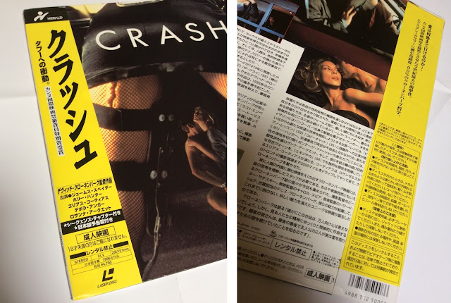


The Japanese Crash is thankfully one of the more common titles still in circulation and one can pick this edition up quite cheaply. As ever prices fluctuate among eBay dealers but prepare to pay €20-€25 for this beauty. Incidentally, the Criterion edition remains the definitive laserdisc presentation of the film, transfer wise, but more importantly contains a typically excellent Cronenberg commentary which sadly has never been ported over to later DVD editions. However, if you're curious, the commentary can be downloaded here as an mp3 file...
Monday, 25 September 2017
Diabolus in Musica
Some infernal listening this morning... It's probably the best thing Keith Emerson has done, and while I'm not a fan of Emerson, Lake & Palmer, I do like some progressive rock stuff, so the more overblown excesses of the soundtrack - the Verdi re-write, the choral passages, I can take. I'd like to think Argento saw Emerson doing his famous stage act where he attacked his huge Hammond organ with knives, and thought "That's my man!" Inferno will always stand in the shadow of Suspiria but I find both films work as a terrific double-header. If Suspiria has the thrills and spills (and what incredible spills especially in the opening reel), Inferno is the more sensual of the two, and there are images in the film that profoundly resonates with me, like Irene Miracle's incredibly elegant, almost erotic pen-writing in the opening of the film, the descent into the water-logged basement, or the weird shot of the water rippling as Leigh McCloskey comes round after his fainting fit - images that are forever sketched on the wall of my memory. It's an extraordinary film... One final thought - what a shame Argento never commissioned Tangerine Dream to write a score. The music of Rubycon or Stratosfear combined with Argento's images could have been a match made in Heaven... and Hell.


Friday, 22 September 2017
The Great Crater
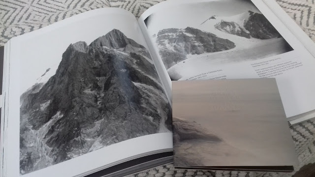
The weather in this part of the world has turned rather wintry these past few days, the promise of an Indian summer has been met with a definite chill in the air, so it’s appropriate that Robin Rimbaud’s latest Scanner album, The Great Crater should drop thru my letterbox on Wednesday courtesy of the excellent Italian Glacial Movements label. The Great Crater, a 49min concept album about a mysterious circular formation seen on the Antarctic ice sheet - a side effect of the continent’s rising temperatures, is one of the finest ambient isolationist albums I’ve heard in many years. This is very much a work with an intuitive understanding of its environment, the beautiful electronic textures unfold like huge empty expanses of white desert while thunderous low end vibrations, Penderecki style plucked strings and disquieting percussive effects suggest a subterranean world in disintegration. Listening to the album another great work of frozen ambient drift came to mind, Thomas Köner’s Nuuk but I think I prefer The Great Crater, it feels more panoramic, immense and perhaps appropriately enough, warmer. Glacial Movements have given the album a fine release, the CD’s exquisite art direction was overseen by Rutger Zuydervelt (aka Machinefabriek) and the album’s title is embossed, crater-like, on the front of the fold-out digipak - a very nice touch. Incidentally, I listened to the album last night whilst leafing thru David Wilson’s excellent coffee table book The Lost Photographs of Captain Scott, and the century old vistas of Scott’s trips to Antarctica made for an excellent visual companion…



Subscribe to:
Posts (Atom)